A lot of Internet arguing is pretty boring as it’s about people taking point in time data, usually “cherry picked” to prove that somehow something will or will not work forever. The current thing is to do with renewables and the odd argument that, since right now they aren’t 100% of the time supplying 100% of the grid with power that they will, therefore, never be able to do so.
This is very boring.
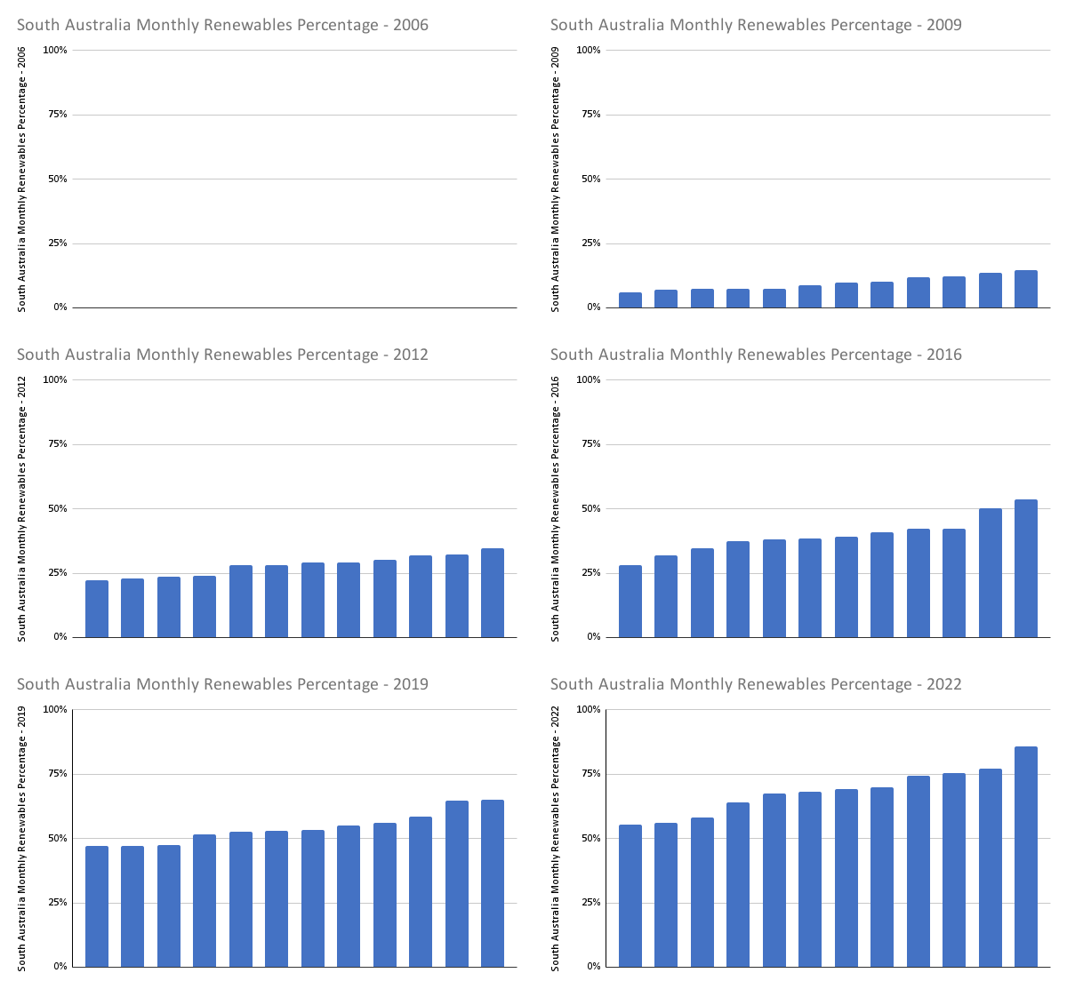
The interesting thing is how things are changing over time. One idea I had was to take the monthly percentage renewable data for South Australia from https://opennem.org.au/energy/sa1/?range=all&interval=1M and stack rank each month by percentage and animate, so we can see each year evolve. Daily data would be better, but this is what I had to hand. Gives a good idea of how the best and worst month is changing.
South Australia, as I type this, is already above 70% annually for renewable power and the addition of roof top solar as well as grid scale batteries, solar and wind means this graph will continue to get better.
Time is all we have really.

Leave a Reply