The Internet often has arguments about “Why is SA’s per kWh so high when you claim renewables are cheap?” and the answer given is “Well, SA has a big long transmission network and not many customers” but that’s often not very satisfying. So I figured I’d put some data together to try and help people understand it a bit better and compare the networks across Australia.
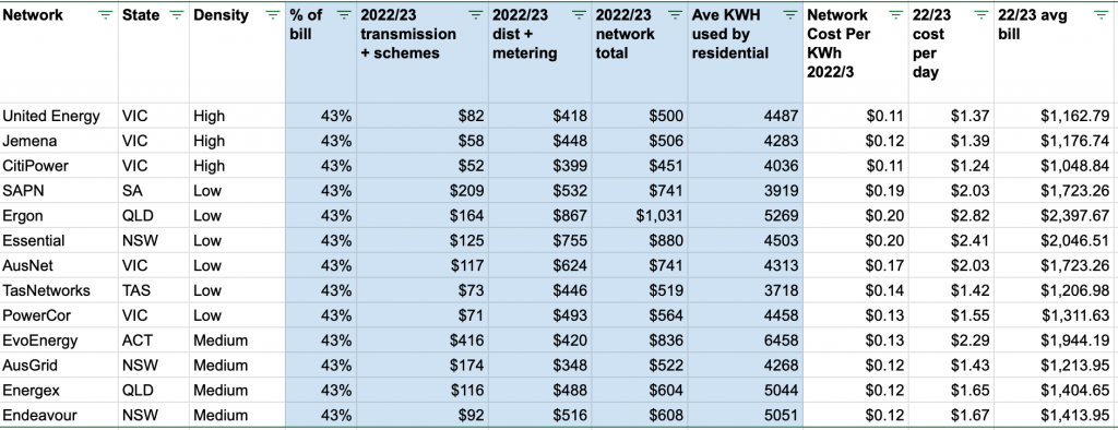
Luckily AER makes determinations each year as to what the various DNSPs (Distributed Network Service Provider ) can charge. So I took the FY (Financial Year) 2023/2024 ones for each DNSP in Australia and put them in a single GoogleSheet. Here’s what I learnt. (Google Sheet is here)
The Data in Blue is from the AER Price determination PDFs https://www.aer.gov.au/networks-pipelines/determinations-access-arrangements/pricing-proposals-tariffs. Google Sheet above links to each one.
Here’s a few things I’ve gleaned from the data above:
Everywhere in Australia the poles/wires/etc component is set at 43% of the average bill. I didn’t realise this was specifically fixed.
Generally networks in the smaller states have smaller transmission costs (5th column). That kind of makes sense – less distance. Victoria seems the winner here being high population/small state. SA, NSW, QLD have generally higher costs with SA being a physically large state with small population. ACT is a little bit of an outlier but I suspect that’s to do with the “schemes” bit – not bad schemes but how they’ve done a lot of CfD arrangements for renewables around Australia. If you read the AER price determination for ACT it does suggest that this is the case, and if you look at the 2023-2024 numbers it has done very well for ACT consumers – link here. The average per customer kWh (8th column) is very varied between states and networks. This has a major effect on the final per KWh price as fixed costs are allocated across less units. SA particularly also is low here (under 4000kWh/yr compared with, say, QLD being over 5000kWh). I expect QLD is high due to mild climate, more aircon, but VIC is lower due to more domestic gas heating. Maybe SA is mild and more solar offsets? Likely a few reasons here.
The networks with “Low Density” have higher distribution and metering costs. (Density is me slicing the networks up according to customers per km. Look at the Google Sheet for explanation).
So, in the end, the data kind of agrees – South Australia’s single network (SA Power Networks) has a low density of customers per km, covering a large distance and the individual customers don’t use as much, so the outcome is higher unit costs. Note that this is completely independent of how the power is produced.
The data is in the Google Sheet referenced above, so feel free to copy and play with it to your hearts content.
As always if there’s some weird error or misunderstanding let me know.